


Upcycling scrapwood
Old furniture has nine lives too
When I arrived back from four weeks away, Gigi had accumulated this stock of handcrafted furniture waiting for a paint and finishing touch. There's little that excites me more than clean lines pushing in from the horizon (especially in a secret wave spot), well made sushi, and a blank canvas to paint on! Needless to say I got stuck in as soon I could. The Portuguese climate is simply brilliant for working outdoors so I got to top up my Vitamin D too after four weeks in overcast Ireland.
Recently my YouTube fix is Kacha and her furniture art (this has replaced watching watercolors being painted - I find both so therapeutic!) so I had lots of ideas to try out.
Luckily for me, I know how to mix my own paint so I don't invest too much in materials and I can try a variety of shades before settling on the right one.
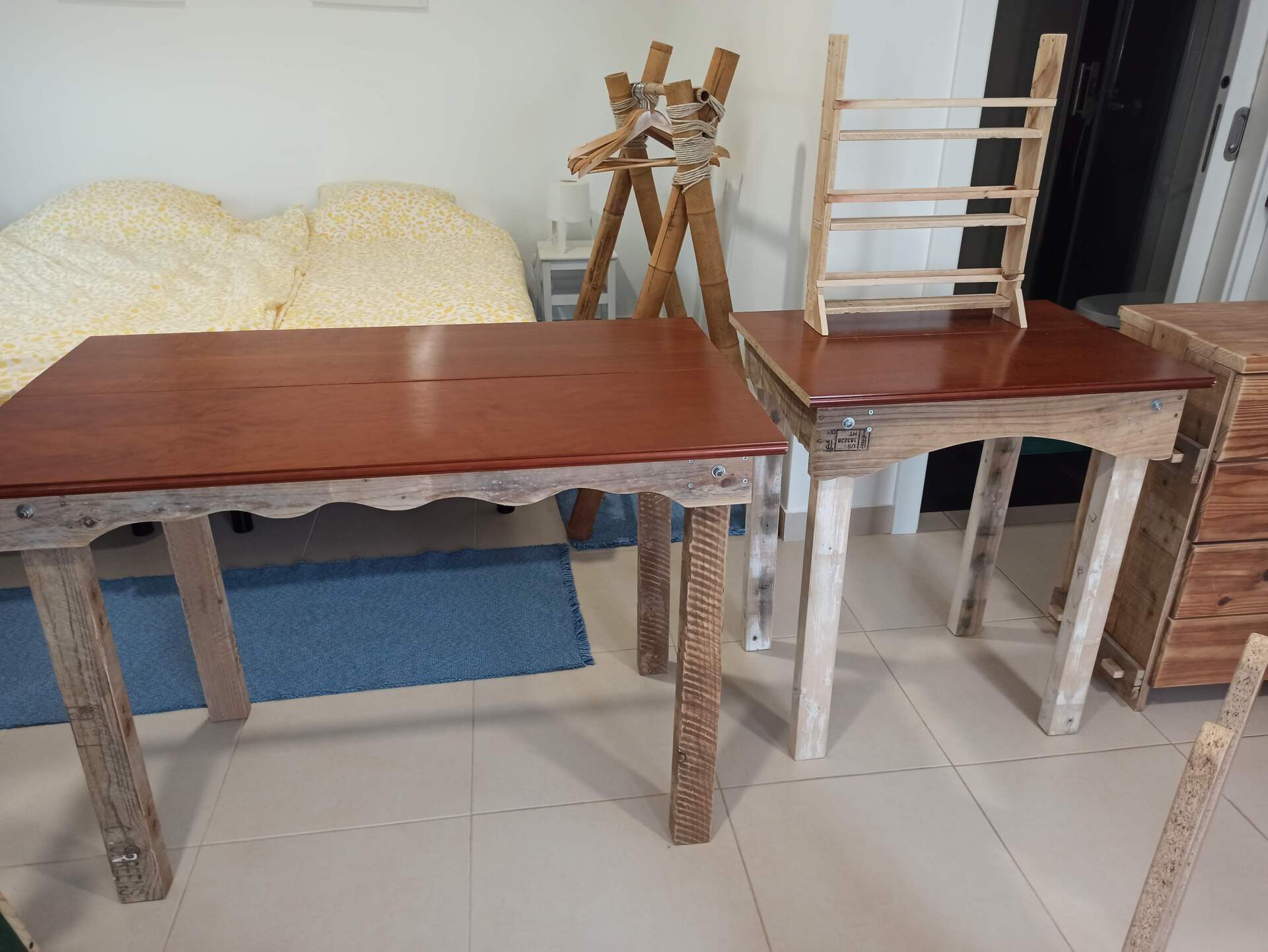
The scrap wood used for the base of these desks was pretty rough looking so my first idea was to give them a white undercoat, so as to start with a brighter canvas.
Yellow is one of my favorite colours, especially when paired with blue (sand, sea and sky no less) so I have been dreaming of painting a whole wall in the Kelly Slater room a mellow yellow. I figured I could start with the Kelly desk and see how good it looks. I mixed my own yellow by simply adding yellow tint to white acrylic - I use up wall paint where I can, and where it has good coverage. All my paint is water based, easy to clean and better for the environment.
I got a lovely lemon yellow that I thought was just perfect....until I took the preliminary product up to the studio where I noticed how it clashed (and so badly!) with the sunset duvet set. In any case, the structure needed a second coat so the lemon yellow just serves as a further brightener to the finished tone. I added the teeniest drop of red dye to my mix to get the perfect sunset yellow.
The Gerry desk looked pretty awful with the white undercoat, as the wood itself was pretty discolored and rough. What I noticed however was that the cool stamps on the pallet wood showed through the paint and in some cases, are branded in, giving a nice textured print. My next thought was to color up the white with Petroleum Blue (used in the bookshelf and other places in the house) and so I experimented with dry brushing, to highlight the textures areas. Petroleum Blue in itself is too dark a color for the Gerry room. I decide to go with the lovely dusky cacao color used on the feature wall as a top layer, letting the Petroleum Blue color to peek through and again bringing out the stencil pattern of the branding. It just so happens that Petroleum Blue shows up in my oil painting in that room - a sweet coincidence or my subconscious showing that I like this color so much!
The layered look was so appealing, I decided to go with dry brushing instead of distressing on both pieces (and another piece for our own home). I had a bit of Miami blue remaining in the tin, and since I've used this to highlight the wardrobe panels in the Slater room, I decided to use a bit of this on the desk too. This turned out quite simply amazing looking, so much so that I took a bit of the Miami brush to the Gerry desk too!
The most important trick with dry brushing, as with distressing and layering, is to know when to stop! I think I stopped just in time, partially because the glorious weather was drying my brushed too fast to work with! But all in all I'm thrilled with the outcome. Check out our instagram for the in between photos!
SecretSurfHouse Blog